
Easeful Themes for ACF renders a field group on the front end with a design theme: a set of settings for spacing, cards, text, labels and colors that you pick per field group and can copy and adjust with a live preview.
Four themes ship with the plugin:
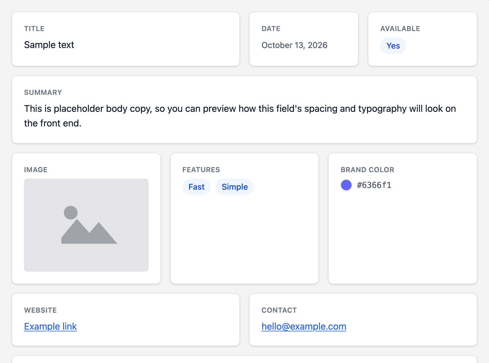
- ‘Classic’ — a light, clean look: each field in a white card with a soft shadow and rounded corners. Field groups use it until you pick another.
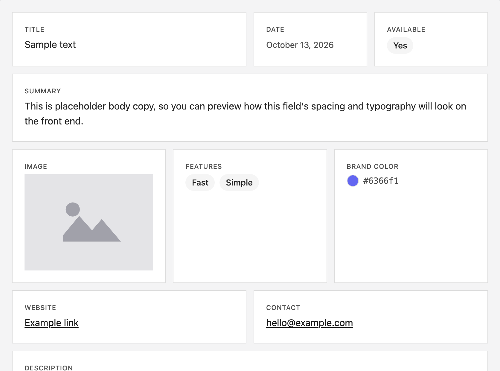
- ‘Minimal’ — each field in a flat, square card with a thin border, no shadow, and small, widely spaced labels.
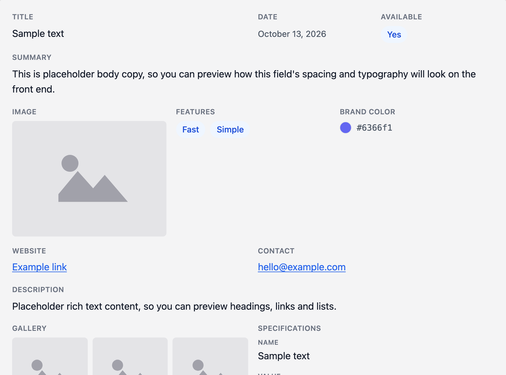
- ‘Plain’ — no cards at all: no background, border, shadow or padding around the fields, and repeater and group rows are flat too. Only the space between the fields is kept, so the group blends into your page.
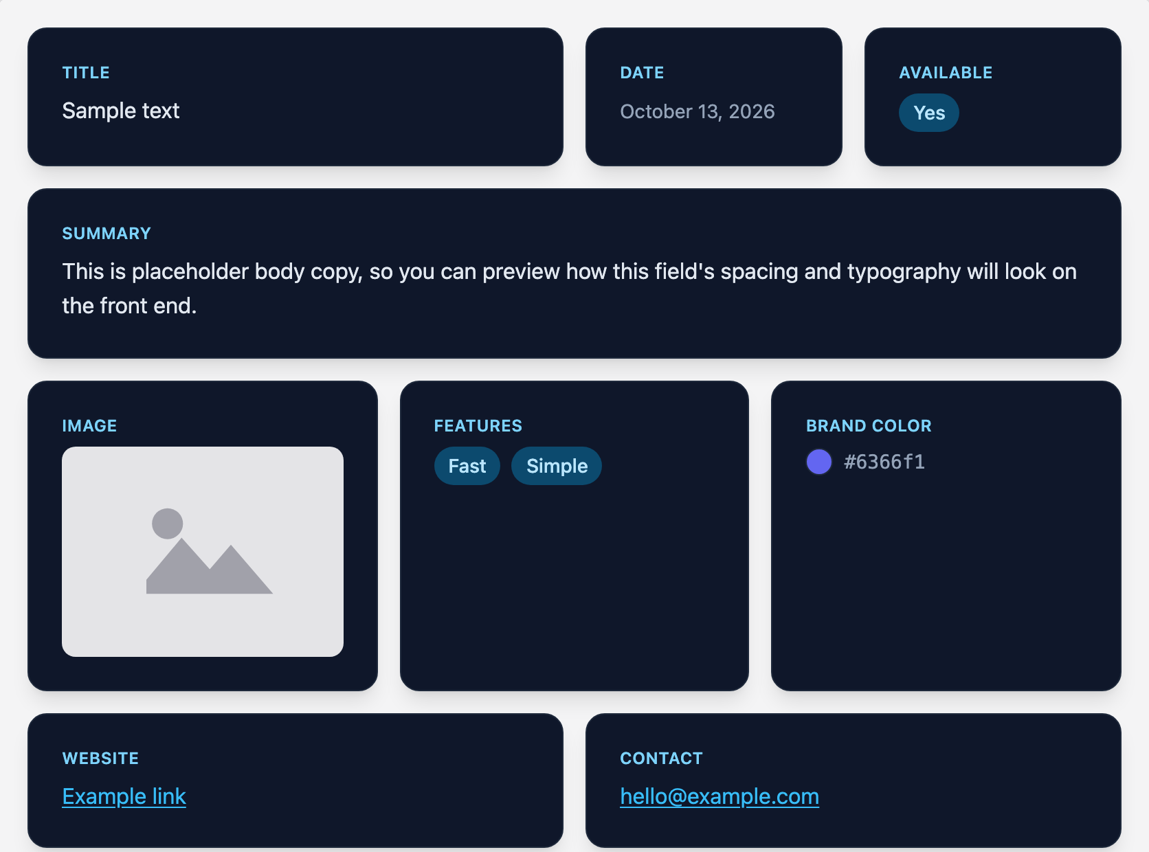
- ‘Midnight’ — a dark design: each field in a deep navy card with a large shadow and sky-blue labels and links.
A theme is a design for the group’s fields, not your site’s WordPress theme; it sits inside whatever page your site already renders.
What the themes look like #
How to Choose a Theme for a Field Group #
-
Edit the field group, scroll down to its Settings box and switch to the ‘Design’ tab.

-
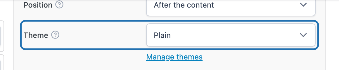
In the ‘Display’ section on the right, choose a theme from the ‘Theme’ list. The list holds the built-in themes and any you have created yourself.
-
Click ‘Save Changes’ at the top of the screen.
The group now renders in that theme wherever it appears on the front end — through automatic display, the shortcode, or the template tag. To use a different theme in one spot only, add theme="minimal" (or any theme’s key) to the shortcode.
How to Create Your Own Theme #
Themes live on their own screen, so one theme can be shared by any number of field groups and a change to it shows up on all of them. The built-in themes can’t be edited, but you can duplicate one and adjust the copy.
-
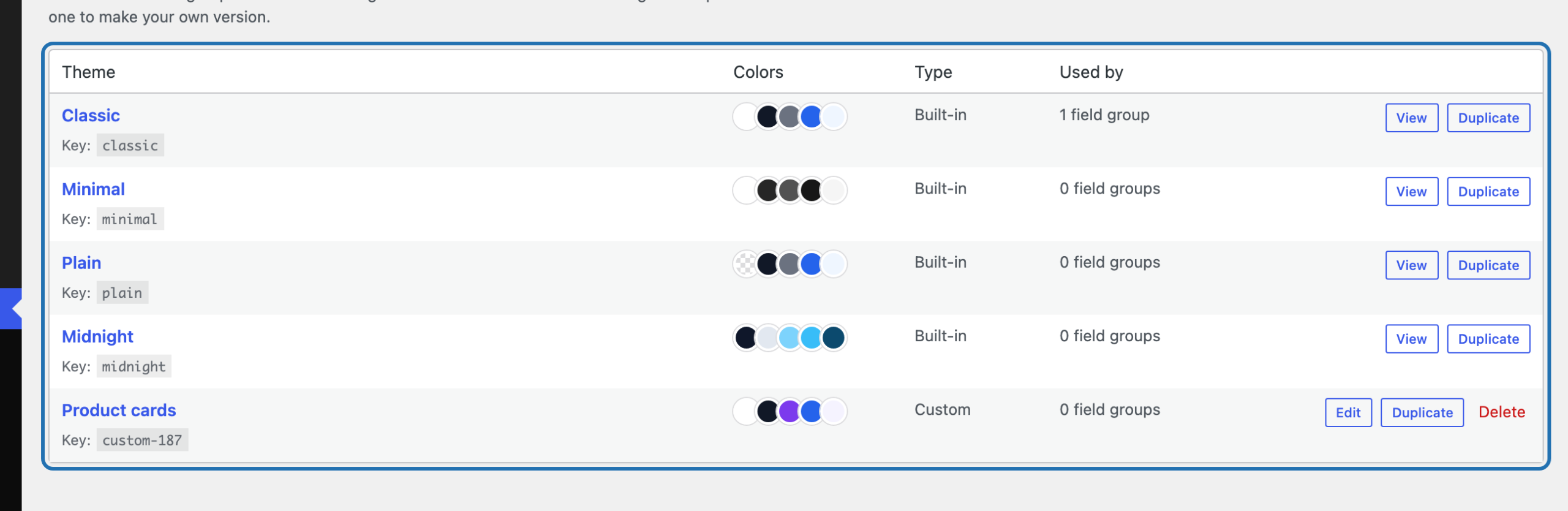
Go to ACF → Themes. The list shows every theme with its key, a few of its colors, whether it’s built-in or your own, and how many field groups use it.
-
Click ‘View’ on the built-in theme closest to what you want, then ‘Duplicate this theme’. You’re taken straight to your editable copy. You can also start from scratch with ‘Add New Theme’ at the top of the list.
-
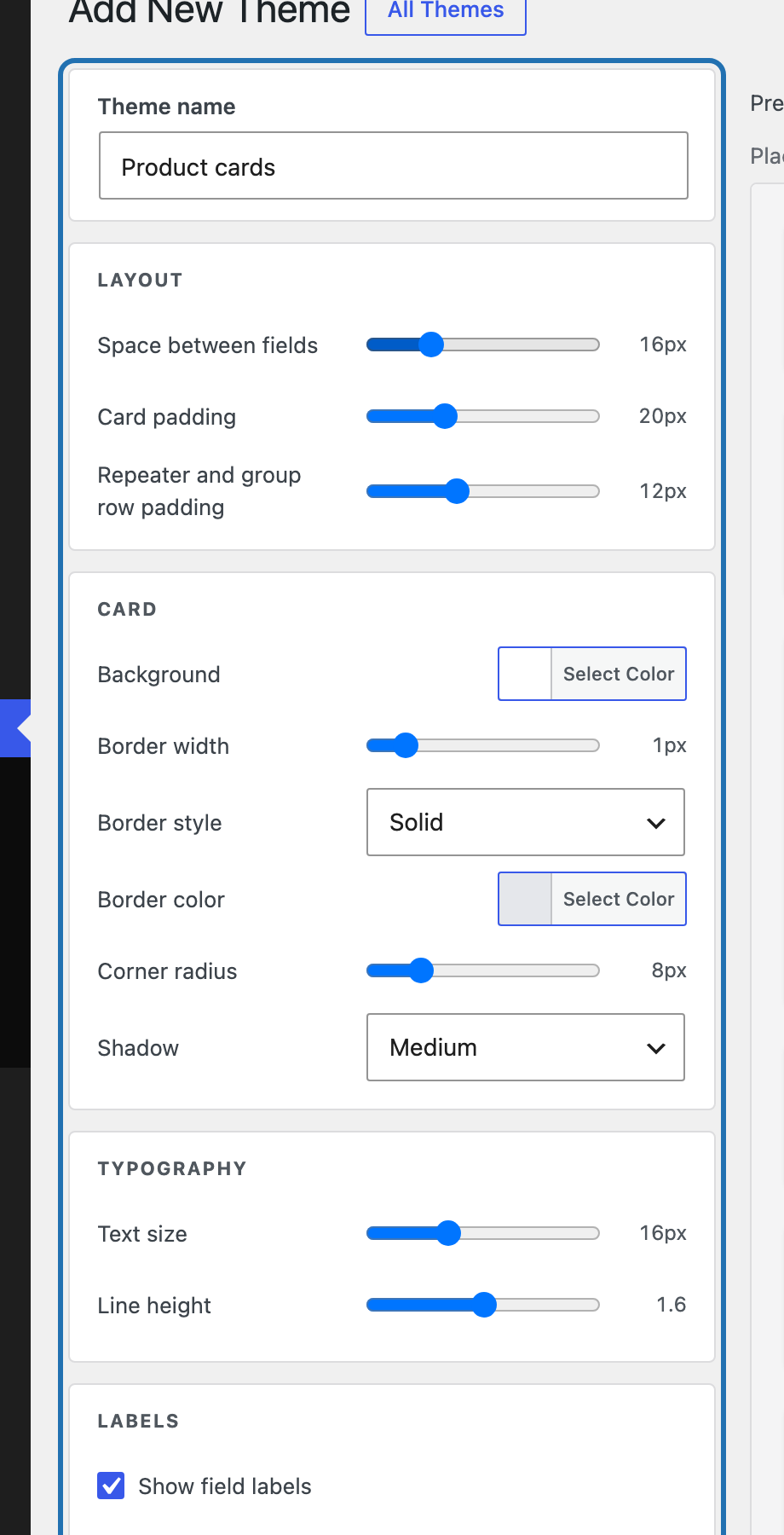
Give the theme a name and adjust its settings on the left. They’re grouped into ‘Layout’ (space between fields, card padding and the padding inside repeater and group rows), ‘Card’ (background, border, corners and shadow — choose ‘Custom’ under ‘Shadow’ to set its offset, blur, spread, color and opacity yourself), ‘Typography’, ‘Labels’ (including ‘Show field labels’, which you can turn off to show only the values), ‘Colors’ and ‘Media’. Every color can also be made see-through with the transparency strip in its color picker.
-
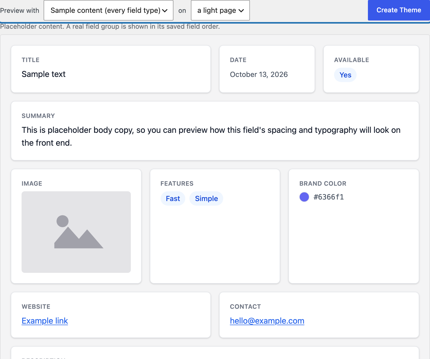
Check the result in the preview on the right, which updates as you change a setting. Use ‘Preview with’ to switch between sample content that covers every field type and one of your own field groups in its saved field order, and choose a light or dark page to match where the group will appear.
-
Click ‘Save Theme’ (‘Create Theme’ for a new one), either at the top right, next to the preview options, or below the settings.
Your theme now appears in the ‘Theme’ list on every field group’s Design tab. If you later delete it, the field groups that used it switch back to ‘Classic’.


